About Delish
Delish is a plant-based recipe app that features only quick and easy recipes for everyone interested or new to a plant-based diet. It is also suitable for plant-based eaters who struggle to come up with easy recipes.
Delish makes plant-based eating super easy, without losing on the nutrition and taste. It is a personal project which I intend to develop in the near future.
The Project
Delish was designed out of frustration for the current plant based apps which are not beginner friendly. Most recipe apps are aimed at people who are used to cooking. I wanted to design an app which would allow people with no cooking skills to prepare easy and nutritious meals.
I treated this project like any other professional project, with the same dedication and commitment and with the same user centered process.


Understanding the User
After establishing my goals, the next step was to understand user needs. I conducted surveys and interviews with about 20 people new to plant-based eating, interested or already eating this way, to get a better understanding of who I am designing for.
Personas
After completing my user research, I was able to develop two user personas. Tom and Eva are two fictional representations of the real target audience data, gathered in my user interviews.


Wireframes
I always start any project by sketching first; this process allows me to painlessly add changes and alternative solutions almost immediately. When I was satisfied with how the main features worked out on paper, I made wireframes using Figma.


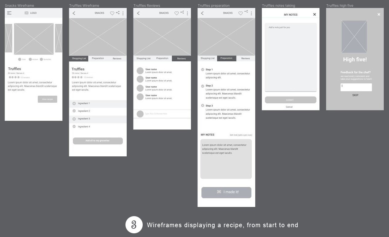
Testing and Iteration
The wireframes were presented to a handful of users during the testing phase. A few things had to be modified, removed or added.
For example, it was pointed out that the recipe page (where users select the recipes) was too stagnant and gave the impression that nothing new was happening.
I added a section “recently added” to notify the user that the app is constantly evolving. I also added a feature that displays a tick box symbol to the recipe that was made.


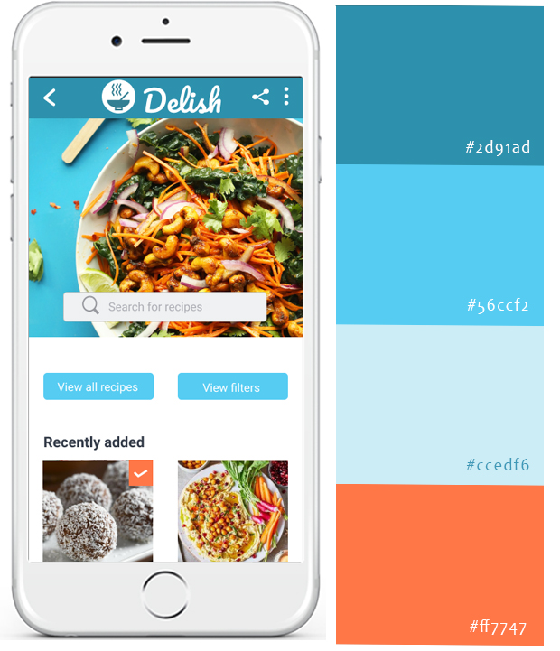
Styling Concepts
The colours used were a combination of :
- dark blue for the top navigation bar, swipe menu and home icons,
- very light blue for elements requiring a subtle background,
- medium blue for secondary call to action in the same page,
- orange for primary call to action buttons.
Blue was chosen for its overall calming effects. As the app contains a lot of pictures of different bright colours, it was best to tone it down with a cold colour. Orange was used because of its complementary to blue and its ability to make a call to action button stand out.
Styling Concepts
The colours used were a combination of:
- dark blue for the top navigation bar, swipe menu and home icons,
- very light blue for elements requiring a subtle background,
- medium blue for secondary call to action in the same page,
- orange for primary call to action buttons.
Blue was chosen for its overall calming effects. As the app contains a lot of pictures of different bright colours, it was best to tone it down with a cold colour. Orange was used because of its complementary to blue and its ability to make a call to action button stand out.
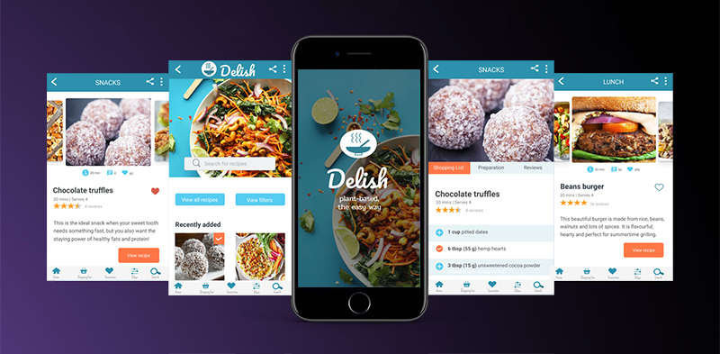
Bringing It All Together
Delish Features


Visual Design